
Imagine inviting a hundred people into your store, watching them glance around for a few seconds, and then seeing ninety-eight of them walk right back out.
Would your first instinct be to spend more money getting another hundred people through the door?
Or would you start wondering what those first hundred people saw when they walked in?
It’s a question worth asking about your website, especially if you’ve been working hard to attract visitors but aren’t seeing much happen once they arrive.
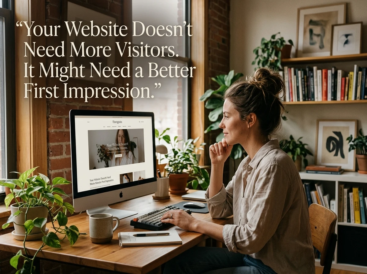
Online business owners spend an enormous amount of time thinking about traffic. Search engine rankings, social media posts, paid advertising, email campaigns, backlinks. There’s always another way to bring more people to a website.
And traffic certainly matters. A website nobody visits isn’t going to accomplish much.
But here’s something that gets overlooked surprisingly often: Sometimes the biggest opportunity isn’t getting more people to your website. It’s making the experience better for the people who are already showing up.
A few small changes to how you communicate, present your offer, and guide visitors can make a bigger difference than another month of chasing traffic.
The Five-Second Conversation Your Website Is Having
Your website starts communicating long before anyone reads an entire paragraph.
The headline, colors, images, layout, and first few sentences all contribute to an immediate impression.
And visitors are quietly asking themselves questions.
Am I in the right place? Is this relevant to me? Does this look trustworthy? Is there something here worth my time?
They may not consciously put those questions into words, but their next action often depends on the answers.
Consider two websites offering exactly the same service.
The first opens with:
“Welcome to Our Website! We Are Committed to Providing Innovative Solutions and Outstanding Customer Satisfaction.”
The second says:
“Spend Less Time Chasing Invoices. Get Paid Faster With Simple Billing Software for Freelancers.”
Both might belong to perfectly legitimate businesses with excellent products.
But the second immediately tells a specific audience what the service does and why they might care.
The first could be selling accounting software, office furniture, or industrial plumbing equipment. Who knows?
Clarity is one of the most underrated forms of persuasion.
When people understand what you’re offering and how it relates to their lives, you’ve already removed one obstacle between curiosity and action.
Stop Explaining What You Do. Start Explaining Why It Matters.
Here’s an interesting exercise.
Visit your own website and look at the first headline, paragraph, or product description.
Now ask yourself: Am I describing my business, or am I helping someone understand what my business can do for them?
There’s an important difference.
A website might proudly announce that it offers “a comprehensive suite of digital marketing tools.”
That sounds impressive enough, but it doesn’t give a visitor much to picture.
Compare it with:
“Create Your Emails, Schedule Your Social Posts, and Track Your Marketing From One Place.”
Now the visitor can imagine using the service.
This distinction matters just as much for affiliate marketers.
If you’re recommending a product, don’t simply repeat the manufacturer’s feature list. Explain which problem those features solve, who would benefit, and what someone should realistically expect.
People don’t necessarily want a product with seventeen impressive features.
They want to accomplish something, solve something, avoid something, or make some part of their lives a little easier.
The closer your message gets to that underlying motivation, the more useful your website becomes.
Your Visitors Shouldn’t Need a Treasure Map
Have you ever landed on a website and found yourself wondering where you’re supposed to click?
Maybe the navigation has twelve different options. There are three competing buttons, a popup asking for your email address, and a flashing banner announcing something that apparently cannot wait.
Somewhere underneath all that excitement is probably a perfectly good offer.
But finding it shouldn’t require detective work.
One of the simplest ways to improve a website is to decide what you want a visitor to do next, then make that next step obvious.
That doesn’t mean every page needs an enormous button screaming “BUY NOW!”
Sometimes the appropriate next step is reading an article, comparing two products, watching a demonstration, or learning more about a service.
The important thing is that the page has a logical direction.
If someone finishes reading your introduction and thinks, “Okay, this sounds interesting. Now what?” your website should have a helpful answer.
And if there are several possible next steps, consider which one matters most for that particular page.
Giving people choices can be useful. Giving them too many choices at once can make the decision unnecessarily difficult.
The Little Things That Make People Trust You
Trust is a fascinating part of online business because it often develops through details that seem almost too small to matter.
A website doesn’t necessarily need a spectacular design or an expensive branding agency to appear credible.
It does need to feel like somebody cares about the experience.
Think about the signals visitors encounter along the way.
A page that loads properly on their phone. A contact link that actually works. Product information written in plain English. Prices and conditions that aren’t mysteriously hidden until the final step.
Even ordinary proofreading matters.
One typo probably won’t destroy anyone’s confidence. But a website filled with broken links, outdated information, exaggerated claims, and awkward formatting can gradually create the impression that nobody is paying attention.
For affiliate websites, trust becomes especially important because visitors are often evaluating both the product and the person recommending it.
Being transparent about affiliate relationships, acknowledging a product’s limitations, and explaining who it might not be right for can make a recommendation more credible.
You don’t have to pretend everything you recommend is perfect.
In fact, a thoughtful explanation of the tradeoffs can be more persuasive than another paragraph of glowing adjectives.
And whenever you use testimonials, customer reviews, or results, make sure they’re genuine and presented with appropriate context.
Credibility isn’t something you can manufacture with a fancy badge.
It’s something your website earns through the way it treats people.
A Simple Way to See Your Website Through Fresh Eyes
One problem with building your own website is that you already know everything about it.
You know what the business does. You know where the important pages are. You know what every button means and why you organized the information the way you did.
Your visitors don’t have that advantage.
They’re arriving without the owner’s manual.
Here’s a useful experiment: Open your website on your phone, pretend you’ve never seen it before, and give yourself thirty seconds to explore.
Better yet, ask someone unfamiliar with your business to do it.
Don’t explain anything beforehand. Just observe what they notice and where they hesitate.
Then ask three questions:
- What do you think this website offers?
- Who do you think it’s meant to help?
- What would you click if you wanted to get started?
If the answers surprise you, congratulations. You’ve just discovered something potentially more valuable than another traffic source.
You have an opportunity to make your website easier to understand.
And you didn’t have to buy a single advertisement to find it.
The First-Impression Tune-Up
You don’t need to redesign your entire website to improve how visitors experience it.
In fact, changing everything at once can make it harder to tell what actually helped.
A better approach is to look at a few important elements individually.
Five small improvements that can help visitors understand, trust, and act on your offer.
Think of these as five places where small improvements can remove unnecessary friction.
A clearer headline can help visitors recognize that they’ve found something relevant.
A more specific explanation can help them understand the value of an offer.
A visible trust signal can reduce uncertainty.
A cleaner layout can make the page easier to explore.
And a well-placed call to action can help someone take the next step without wondering what to do.
None of these improvements guarantees a sale, a subscriber, or a new customer.
But each addresses a potential reason someone might leave before giving your offer a fair chance.
Better Results Don’t Always Require More Traffic
Let’s imagine two websites that each receive 1,000 visitors in a month.
Both offer a free guide in exchange for an email address.
Two websites. 1,000 monthly visitors each. One simple difference.
Website B doesn’t have a larger audience. It simply converts a higher percentage of its existing visitors into subscribers.
Of course, improving a conversion rate from 2% to 4% isn’t automatic. It may take testing, better messaging, a stronger offer, or a combination of improvements.
But the example illustrates why website effectiveness deserves attention alongside traffic growth.
And it reveals another advantage.
When your website does a better job of helping visitors take meaningful action, future traffic becomes more valuable too.
That article you publish next week, the social media campaign you’re planning, or the advertisement you eventually run can all benefit from improvements you’ve already made.
Rather than choosing between traffic and conversion, you’re making the two work together.
Don’t Confuse a Pretty Website With an Effective One
There’s one final distinction worth making.
A beautiful website isn’t necessarily a successful website.
You can spend weeks perfecting colors, animations, typography, and image placement while completely overlooking the question of whether visitors understand your offer.
And you can have a fairly simple website that performs well because it communicates clearly, answers important questions, and makes the next step easy.
Good design supports communication. It shouldn’t compete with it.
That doesn’t mean appearance is unimportant. A polished, welcoming presentation can contribute to trust and make information easier to absorb.
But every design decision should ultimately serve the person using the website.
Before changing a font, adding another animation, or installing the latest website plugin, ask whether the change will make something clearer, easier, faster, or more useful.
If it won’t, it might just be decoration.
And decoration rarely fixes a confusing offer.
Before You Chase Your Next Thousand Visitors
There’s nothing wrong with wanting more traffic.
Building an audience is an important part of growing almost any online business, and consistent promotion can create opportunities that wouldn’t otherwise exist.
But the next time you find yourself searching for a new advertising strategy or wondering how to attract more visitors, consider spending a little time on the website they’re going to visit.
Read your headline as though you’ve never seen it before.
Look for questions your content leaves unanswered.
Check whether your pages work comfortably on a phone.
Make sure the next step is obvious.
And perhaps most importantly, ask whether your website is speaking to the visitor’s needs or simply talking about itself.
Sometimes a small improvement in the right place can do more than a large amount of effort in the wrong one.
Before you invite another thousand people through your digital front door, make sure the people already arriving have a good reason to stay.

Stone Evans is the founder of Plug-In Profit Site and a longtime online entrepreneur who has helped thousands of people build real income online. After leaving a traditional brick-and-mortar business, Stone built a multiple six-figure income online by focusing on simple systems, consistency, and helping others succeed. He now runs Plug-In Profit Site to make starting an online business faster, easier, and more accessible for everyday people. Learn more about how Stone helps beginners build income online through his step-by-step system.